I was given a branding assignment with GoPath Laboratories to help give a unique design to a new kit meant to hit market. The purpose of this design was to help modernize the brand and help refine a color palette to be used throughout the company. Helping to refine existing branding guidelines, I helped create a kit with a fresh, modern design.
Existing branding, which we further tweaked. This is branding used on marketing materials, but I wanted to explore a bold design. Given the demographic for this kit, I wanted to ensure we balanced this out with a serif font, Alverata. A similar weight to the existing branding guidelines, I was able to introduce an alternative font to be used for this revamped branding.
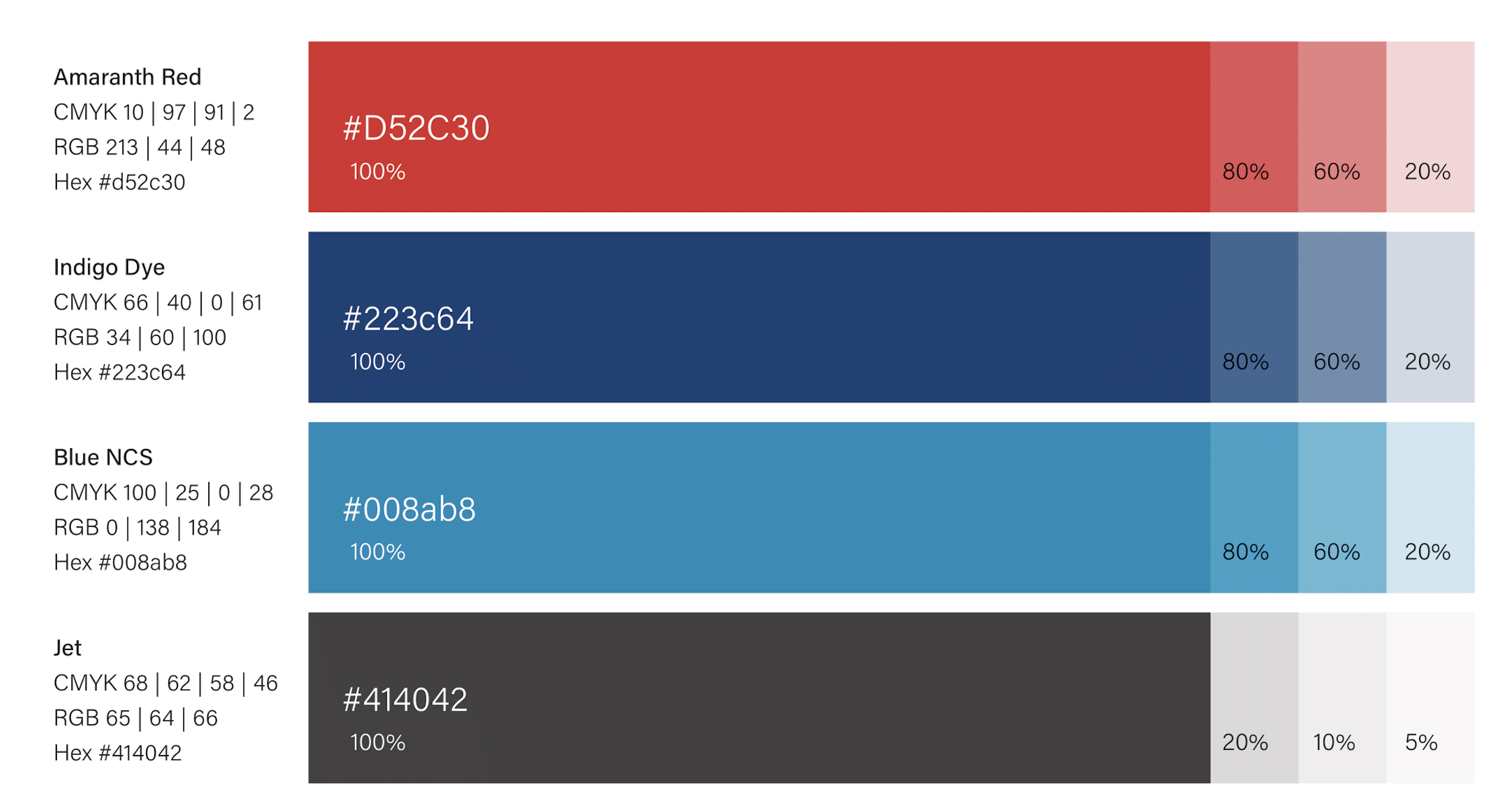
Some existing branding. For this kit, I leaned into the blue and red to match the subject matter of a Saliva/Blood kit. These color mixes also help support the demographic and subject matter. I delved a little further into these mixes and broke it down even further for this kit. Rajah and Light Coral would be a focus in a different kit.
I divided the colors even further, tying it back to a logo redesign. The original blue was dark, which I ultimately ended up using in this kit. However, I wanted to explore the possibility of a lighter blue to add to the color family for a greater variety of products.
Kit Display exploration with font suggestion, alongside suggestions for colors to be used for a Saliva/Blood Kit.
Artwork created to show color blocking, dielines.


